Plotting Phase Diagrams#
In this notebook, we provide examples from class where we have plotted 1D and 2D phase diagrams. We will use the matplotlib library to create these plots.
import numpy as np
import matplotlib.pyplot as plt
from matplotlib import style
plt.style.use('seaborn-v0_8-colorblind')
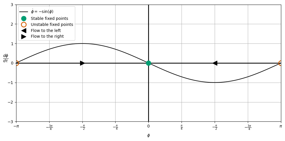
x = np.linspace(-2*np.pi, 2*np.pi, 1000)
mu = 0
xdot = mu - np.sin(x)
fig, ax = plt.subplots(figsize=(10, 5))
ax.plot(x, xdot, 'k', label=r'$\dot{\phi} = -\sin(\phi)$')
ax.axhline(0, color='black', linewidth=2)
ax.axvline(0, color='black', linewidth=2)
plt.plot([0], [0],
'C1o',
markersize=12,
label='Stable fixed points')
plt.plot([-np.pi, np.pi], [0, 0],
'C2o',
markersize=12,
markerfacecolor='none',
markeredgewidth=2,
markeredgecolor='C2',
label='Unstable fixed points')
plt.plot([np.pi/2], [ 0],
'k<',
markersize=12,
label='Flow to the left')
plt.plot([-np.pi/2], [0],
'k>',
markersize=12,
label='Flow to the right')
plt.legend(loc='upper left')
plt.xlim(-1*np.pi, np.pi)
xticks = [-np.pi, -3*np.pi/4, -np.pi/2, -np.pi/4, 0, np.pi/4, np.pi/2, 3*np.pi/4, np.pi]
xticks_labels = [r'$-\pi$', r'$-\frac{3\pi}{4}$', r'$-\frac{\pi}{2}$', r'$-\frac{\pi}{4}$', r'$0$', r'$\frac{\pi}{4}$', r'$-\frac{\pi}{2}$', r'$-\frac{3\pi}{4}$', r'$\pi$']
ax.set_xticks(xticks)
ax.set_xticklabels(xticks_labels)
plt.ylim(-3, 3)
ax.set_xlabel(r'$\phi$')
ax.set_ylabel(r'$\dfrac{d\phi}{d\tau}$', rotation=0)
ax.grid()
plt.tight_layout()
plt.show()
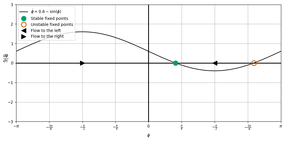
import numpy as np
import matplotlib.pyplot as plt
from matplotlib import style

plt.style.use('seaborn-v0_8-colorblind')

x = np.linspace(-2*np.pi, 2*np.pi, 1000)
mu = 0.6
xdot = mu - np.sin(x)

fig, ax = plt.subplots(figsize=(10, 5))

ax.plot(x, xdot, 'k', label=r'$\dot{\phi} = 0.6-\sin(\phi)$')

ax.axhline(0, color='black', linewidth=2)
ax.axvline(0, color='black', linewidth=2)

plt.plot([0.643], [0],
         'C1o',
         markersize=12,
         label='Stable fixed points')

plt.plot([2.5], [0],
         'C2o',
         markersize=12,
         markerfacecolor='none',
         markeredgewidth=2,
         markeredgecolor='C2',
         label='Unstable fixed points')

plt.plot([np.pi/2], [ 0],
         'k<',
         markersize=12,
         label='Flow to the left')
plt.plot([-np.pi/2], [0],
         'k>',
         markersize=12,
         label='Flow to the right')

plt.legend(loc='upper left')
plt.xlim(-1*np.pi, np.pi)

xticks = [-np.pi, -3*np.pi/4, -np.pi/2, -np.pi/4, 0, np.pi/4, np.pi/2, 3*np.pi/4, np.pi]
xticks_labels = [r'$-\pi$', r'$-\frac{3\pi}{4}$', r'$-\frac{\pi}{2}$', r'$-\frac{\pi}{4}$', r'$0$', r'$\frac{\pi}{4}$', r'$-\frac{\pi}{2}$', r'$-\frac{3\pi}{4}$', r'$\pi$']
ax.set_xticks(xticks)
ax.set_xticklabels(xticks_labels)

plt.ylim(-3, 3)
ax.set_xlabel(r'$\phi$')
ax.set_ylabel(r'$\dfrac{d\phi}{d\tau}$', rotation=0)
ax.grid()

plt.tight_layout()
plt.show()
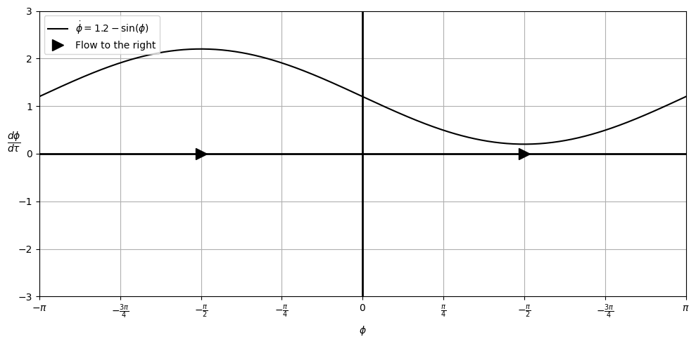
import numpy as np
import matplotlib.pyplot as plt
from matplotlib import style

plt.style.use('seaborn-v0_8-colorblind')

x = np.linspace(-2*np.pi, 2*np.pi, 1000)
mu = 1.2
xdot = mu - np.sin(x)

fig, ax = plt.subplots(figsize=(10, 5))

ax.plot(x, xdot, 'k', label=r'$\dot{\phi} = 1.2-\sin(\phi)$')

ax.axhline(0, color='black', linewidth=2)
ax.axvline(0, color='black', linewidth=2)

plt.plot([-np.pi/2, np.pi/2], [0, 0],
         'k>',
         markersize=12,
         label='Flow to the right')

plt.legend(loc='upper left')
plt.xlim(-1*np.pi, np.pi)

xticks = [-np.pi, -3*np.pi/4, -np.pi/2, -np.pi/4, 0, np.pi/4, np.pi/2, 3*np.pi/4, np.pi]
xticks_labels = [r'$-\pi$', r'$-\frac{3\pi}{4}$', r'$-\frac{\pi}{2}$', r'$-\frac{\pi}{4}$', r'$0$', r'$\frac{\pi}{4}$', r'$-\frac{\pi}{2}$', r'$-\frac{3\pi}{4}$', r'$\pi$']
ax.set_xticks(xticks)
ax.set_xticklabels(xticks_labels)


plt.ylim(-3, 3)
ax.set_xlabel(r'$\phi$')
ax.set_ylabel(r'$\dfrac{d\phi}{d\tau}$', rotation=0)
ax.grid()

plt.tight_layout()
plt.show()
import numpy as np
import matplotlib.pyplot as plt
from matplotlib import style
plt.style.use('seaborn-v0_8-colorblind')
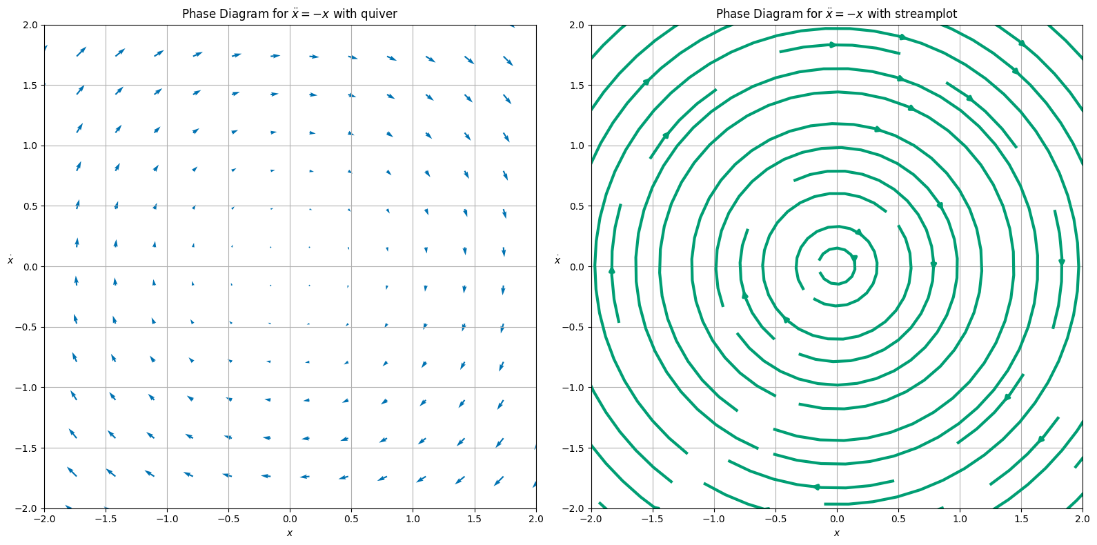
# Define the system of differential equations
def f(x, v):
return v
def g(x, v):
return -x
# Create a grid of points
x = np.linspace(-3, 3, 20)
v = np.linspace(-3, 3, 20)
X, V = np.meshgrid(x, v)
# Compute the derivatives at each point in the grid
U = f(X, V)
W = g(X, V)
## create side-by-side plots
fig, (ax1, ax2) = plt.subplots(1, 2, figsize=(16, 8))
# Plot the vector field using quiver
ax1.quiver(X, V, U, W, color='C0', lw=3)
# Set the labels and title
ax1.set_xlabel(r'$x$')
ax1.set_ylabel(r'$\dot{x}$', rotation=0)
ax1.set_title(r'Phase Diagram for $\ddot{x} = -x$ with quiver')
# Set the limits
ax1.set_xlim(-2, 2)
ax1.set_ylim(-2, 2)
# Add a grid
ax1.grid()
# Plot the streamlines using streamplot
ax2.streamplot(X, V, U, W, color='C1', linewidth=3)
# Set the labels and title
ax2.set_xlabel(r'$x$')
ax2.set_ylabel(r'$\dot{x}$', rotation=0)
ax2.set_title(r'Phase Diagram for $\ddot{x} = -x$ with streamplot')
# Set the limits
ax2.set_xlim(-2, 2)
ax2.set_ylim(-2, 2)
# Add a grid
ax2.grid()
plt.tight_layout()
plt.show()
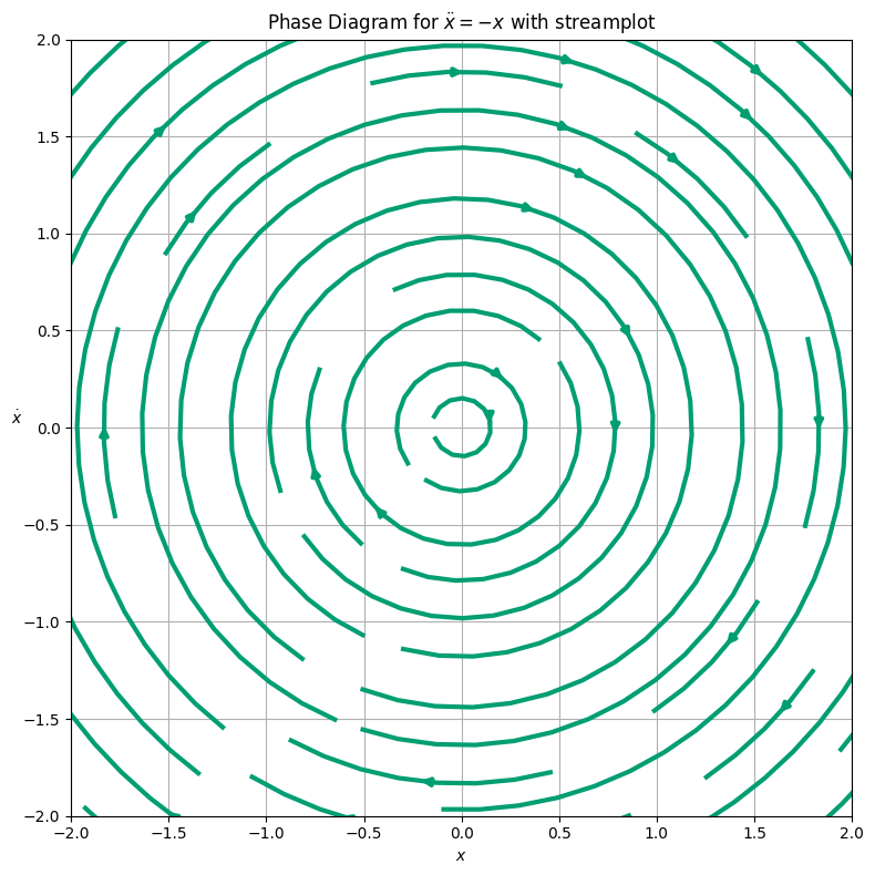
import numpy as np
import matplotlib.pyplot as plt
from matplotlib import style

plt.style.use('seaborn-v0_8-colorblind')

# Define the system of differential equations
def f(x, v):
    return v

def g(x, v):
    return -x

# Create a grid of points
x = np.linspace(-3, 3, 20)
v = np.linspace(-3, 3, 20)
X, V = np.meshgrid(x, v)

# Compute the derivatives at each point in the grid
U = f(X, V)
W = g(X, V)

## create side-by-side plots
fig, ax1 = plt.subplots(1, 1, figsize=(8, 8))


# Plot the streamlines using streamplot
ax1.streamplot(X, V, U, W, color='C1', linewidth=3)

# Set the labels and title
ax1.set_xlabel(r'$x$')
ax1.set_ylabel(r'$\dot{x}$', rotation=0)
ax1.set_title(r'Phase Diagram for $\ddot{x} = -x$ with streamplot')

# Set the limits
ax1.set_xlim(-2, 2)
ax1.set_ylim(-2, 2)

# Add a grid
ax1.grid()

plt.tight_layout()
plt.show()