Day 01: Exploring data with pandas - solution#
This is only one of the possible solutions. There are many ways to answer these questions.
Learning goals#
Today, we will make sure that everyone learns how they can use pandas, matplotlib, and seaborn.
After working through these ideas, you should be able to:
know where to find the documentation for
pandas,matplotlib, andseabornload a dataset with
pandasand explore itvisualize a dataset with
matplotlibandseaborndo some basic data analysis
Notebook instructions#
We will work through the notebook making sure to write all necessary code and answer any questions. We will start together with the most commonly performed tasks. Then you will work on the analyses, posed as research questions, in groups.
Outline:#
Useful imports (make sure to execute this cell!)#
Let’s get a few of our imports out of the way. If you find others you need to add, consider coming back and putting them here.
# necessary imports for this notebook
%matplotlib inline
import pandas as pd
import numpy as np
import matplotlib.pyplot as plt
import seaborn as sns

sns.set_style('ticks') # setting style
sns.set_context('talk') # setting context
sns.set_palette('colorblind') # setting palette
Libraries#
We will be using the following libraries to get started:
numpyfor numerical operations.
The
numpylibrary is a fundamental package for scientific computing in Python. It provides support for large, multi-dimensional arrays and matrices, along with a collection of mathematical functions to operate on these arrays. You can find the documentation here.
pandasfor data manipulation.
The
pandaslibrary is a powerful tool for data analysis and manipulation in Python. It provides data structures like DataFrames and Series, which make it easy to work with structured data. It is quickly becoming the standard for data analysis in Python. You can find the documentation here.
matplotlibfor data visualization.
The
matplotliblibrary is a widely used library for creating static, animated, and interactive visualizations in Python. It provides a flexible framework for creating a wide range of plots and charts. You can find the documentation here.
seabornfor statistical data visualization.
The
seabornlibrary is built on top ofmatplotliband provides a high-level interface for drawing attractive and informative statistical graphics. It simplifies the process of creating complex visualizations. You can find the documentation here.
NOTE: You should read through documentation for these libraries as you go along. The documentation is a great resource for learning how to use these libraries effectively. And the documentation is written the same way for almost all Python libraries, so it is a good skill to develop as you learn to use Python for science.
1. Stellar Classification Dataset - SDSS17#
The Stellar Classification Dataset is a collection of observations of stars from the Sloan Digital Sky Survey (SDSS). The dataset contains various features of stars, such as their brightness, color, and spectral type, which can be used to classify them into different categories. The data set has 100,000 observations of starts, with 17 features and 1 class column. The features include:
Feature |
Description |
|---|---|
obj_ID |
Object Identifier, the unique value that identifies the object in the image catalog used by the CAS |
alpha |
Right Ascension angle (at J2000 epoch) |
delta |
Declination angle (at J2000 epoch) |
u |
Ultraviolet filter in the photometric system |
g |
Green filter in the photometric system |
r |
Red filter in the photometric system |
i |
Near Infrared filter in the photometric system |
z |
Infrared filter in the photometric system |
run_ID |
Run Number used to identify the specific scan |
rereun_ID |
Rerun Number to specify how the image was processed |
cam_col |
Camera column to identify the scanline within the run |
field_ID |
Field number to identify each field |
spec_obj_ID |
Unique ID used for optical spectroscopic objects (this means that 2 different observations with the same spec_obj_ID must share the output class) |
redshift |
Redshift value based on the increase in wavelength |
plate |
Plate ID, identifies each plate in SDSS |
MJD |
Modified Julian Date, used to indicate when a given piece of SDSS data was taken |
fiber_ID |
Fiber ID that identifies the fiber that pointed the light at the focal plane in each observation |
And the class column is:
Feature |
Description |
|---|---|
class |
object class (galaxy, star or quasar object) |
Some of the features are values representing the brightness of the star in different filters, while others are positional coordinates in the sky. The class column indicates whether the object is a galaxy, star, or quasar.
For this exercise, we will use the Stellar Classification Dataset to explore how to load and visualize data using pandas, matplotlib, and seaborn. Later we will use this dataset for some classification and regression tasks.
2. Loading and exploring a dataset#
The goal is typically to read some sort of preexisting data into a DataFrame so we can work with it.
Pandas is pretty flexible about reading in data and can read in a variety of formats. However, it sometimes needs a little help. We are going to read in a CSV file, which is a common format for data.
The Stellar Classification dataset is one that has a particularly nice set of features and is of a manageable size such that it can be used as a good dataset for learning new data analysis techiques or testing out code. This allows one to focus on the code and data science methods without getting too caught up in wrangling the data. However, data wrangling is an authentic part of doing any sort of meaningful data analysis as data more often messier than not.
Although you will be working with this dataset today, you may still have to do a bit of wrangling along the way.
2.1 Reading in the data#
Download the data set from Kaggle and save it in the same directory as this notebook, or you can use the following code to load it if you cloned the repository.
NOTE: We need to check this data for missing values or other issues before we can use it.
✅ Tasks:#
Using
read_csv()to load the dataUsing
head()to look at the first few rows
Note: For this data set, read_csv() will automatically detect the delimiter as a comma, so we don’t need to specify it. If you were reading in a file with a different delimiter, you would need to specify it using the sep parameter. Moreover, if the data had headers that were not the first row, you would need to specify the header parameter.
### your code here

stellar = pd.read_csv('./data/star_classification.csv')
stellar.head()
| obj_ID | alpha | delta | u | g | r | i | z | run_ID | rerun_ID | cam_col | field_ID | spec_obj_ID | class | redshift | plate | MJD | fiber_ID | |
|---|---|---|---|---|---|---|---|---|---|---|---|---|---|---|---|---|---|---|
| 0 | 1.237661e+18 | 135.689107 | 32.494632 | 23.87882 | 22.27530 | 20.39501 | 19.16573 | 18.79371 | 3606 | 301 | 2 | 79 | 6.543777e+18 | GALAXY | 0.634794 | 5812 | 56354 | 171 |
| 1 | 1.237665e+18 | 144.826101 | 31.274185 | 24.77759 | 22.83188 | 22.58444 | 21.16812 | 21.61427 | 4518 | 301 | 5 | 119 | 1.176014e+19 | GALAXY | 0.779136 | 10445 | 58158 | 427 |
| 2 | 1.237661e+18 | 142.188790 | 35.582444 | 25.26307 | 22.66389 | 20.60976 | 19.34857 | 18.94827 | 3606 | 301 | 2 | 120 | 5.152200e+18 | GALAXY | 0.644195 | 4576 | 55592 | 299 |
| 3 | 1.237663e+18 | 338.741038 | -0.402828 | 22.13682 | 23.77656 | 21.61162 | 20.50454 | 19.25010 | 4192 | 301 | 3 | 214 | 1.030107e+19 | GALAXY | 0.932346 | 9149 | 58039 | 775 |
| 4 | 1.237680e+18 | 345.282593 | 21.183866 | 19.43718 | 17.58028 | 16.49747 | 15.97711 | 15.54461 | 8102 | 301 | 3 | 137 | 6.891865e+18 | GALAXY | 0.116123 | 6121 | 56187 | 842 |
2.2 Checking the data#
One of the first things we want to do is check the data for missing values or other issues. The pandas library provides several methods to help us with this. We will start by using info(), which provides a concise summary of the DataFrame, including the number of non-null values in each column and the data types.
This is a good first step to understand the structure of the data and identify any potential issues, such as missing values or incorrect data types. Moreover, it will tell you how your data was imported, and if there are any columns that were not imported correctly.
✅ Tasks:#
Using
info()to check the data types and missing values
What do you notice about the data? Are there any issue with the import?
### your code here

stellar.info()
<class 'pandas.core.frame.DataFrame'>
RangeIndex: 100000 entries, 0 to 99999
Data columns (total 18 columns):
 #   Column       Non-Null Count   Dtype
---  ------       --------------   -----
 0   obj_ID       100000 non-null  float64
 1   alpha        100000 non-null  float64
 2   delta        100000 non-null  float64
 3   u            100000 non-null  float64
 4   g            100000 non-null  float64
 5   r            100000 non-null  float64
 6   i            100000 non-null  float64
 7   z            100000 non-null  float64
 8   run_ID       100000 non-null  int64
 9   rerun_ID     100000 non-null  int64
 10  cam_col      100000 non-null  int64
 11  field_ID     100000 non-null  int64
 12  spec_obj_ID  100000 non-null  float64
 13  class        100000 non-null  object
 14  redshift     100000 non-null  float64
 15  plate        100000 non-null  int64
 16  MJD          100000 non-null  int64
 17  fiber_ID     100000 non-null  int64
dtypes: float64(10), int64(7), object(1)
memory usage: 13.7+ MB
Next, we will use describe() to get a summary of the data. This will give us some basic statistics about the numerical columns in the DataFrame, such as the mean, standard deviation, minimum, and maximum values. This is useful for understanding the distribution of the data and identifying any potential outliers.
Researchers sometimes use aberrant values to identify potential issues with the data, such as errors in data entry or measurement. Sometimes, these values are read in as NaN (not a number) or inf (infinity), which can cause issues with analysis. But, other times, the researcher might force a particular value to be a certain number, such as 0 or 99, to indicate that the value is missing or not applicable.
✅ Tasks:#
Using
describe()to get a summary of the data
What do you notice about the data? Are there any issue with starting the analysis?
### your code here

stellar.describe()
| obj_ID | alpha | delta | u | g | r | i | z | run_ID | rerun_ID | cam_col | field_ID | spec_obj_ID | redshift | plate | MJD | fiber_ID | |
|---|---|---|---|---|---|---|---|---|---|---|---|---|---|---|---|---|---|
| count | 1.000000e+05 | 100000.000000 | 100000.000000 | 100000.000000 | 100000.000000 | 100000.000000 | 100000.000000 | 100000.000000 | 100000.000000 | 100000.0 | 100000.000000 | 100000.000000 | 1.000000e+05 | 100000.000000 | 100000.000000 | 100000.000000 | 100000.000000 |
| mean | 1.237665e+18 | 177.629117 | 24.135305 | 21.980468 | 20.531387 | 19.645762 | 19.084854 | 18.668810 | 4481.366060 | 301.0 | 3.511610 | 186.130520 | 5.783882e+18 | 0.576661 | 5137.009660 | 55588.647500 | 449.312740 |
| std | 8.438560e+12 | 96.502241 | 19.644665 | 31.769291 | 31.750292 | 1.854760 | 1.757895 | 31.728152 | 1964.764593 | 0.0 | 1.586912 | 149.011073 | 3.324016e+18 | 0.730707 | 2952.303351 | 1808.484233 | 272.498404 |
| min | 1.237646e+18 | 0.005528 | -18.785328 | -9999.000000 | -9999.000000 | 9.822070 | 9.469903 | -9999.000000 | 109.000000 | 301.0 | 1.000000 | 11.000000 | 2.995191e+17 | -0.009971 | 266.000000 | 51608.000000 | 1.000000 |
| 25% | 1.237659e+18 | 127.518222 | 5.146771 | 20.352353 | 18.965230 | 18.135828 | 17.732285 | 17.460677 | 3187.000000 | 301.0 | 2.000000 | 82.000000 | 2.844138e+18 | 0.054517 | 2526.000000 | 54234.000000 | 221.000000 |
| 50% | 1.237663e+18 | 180.900700 | 23.645922 | 22.179135 | 21.099835 | 20.125290 | 19.405145 | 19.004595 | 4188.000000 | 301.0 | 4.000000 | 146.000000 | 5.614883e+18 | 0.424173 | 4987.000000 | 55868.500000 | 433.000000 |
| 75% | 1.237668e+18 | 233.895005 | 39.901550 | 23.687440 | 22.123767 | 21.044785 | 20.396495 | 19.921120 | 5326.000000 | 301.0 | 5.000000 | 241.000000 | 8.332144e+18 | 0.704154 | 7400.250000 | 56777.000000 | 645.000000 |
| max | 1.237681e+18 | 359.999810 | 83.000519 | 32.781390 | 31.602240 | 29.571860 | 32.141470 | 29.383740 | 8162.000000 | 301.0 | 6.000000 | 989.000000 | 1.412694e+19 | 7.011245 | 12547.000000 | 58932.000000 | 1000.000000 |
2.3 Slicing the data#
You likely noticed there were some problematic values in the data; some of the photometric values are negative, which is not possible. We will need to remove these rows from the DataFrame before we can do any analysis. However, we can also use this as an opportunity to practice slicing the DataFrame. So we will also reduce the DataFrame to only the columns we are interested in.
Slicing a DataFrame is a common operation in pandas and allows you to select specific rows and columns based on certain conditions. You can use boolean indexing to filter the DataFrame based on conditions, such as selecting rows where a certain column is greater than a certain value. Here’s some common examples of slicing a DataFrame:
# Select all rows where the 'u' column is greater than 0
df_u_positive = df[df['u'] > 0]
# Select specific columns
df_selected_columns = df[['obj_ID', 'class', 'u', 'g', 'r', 'i', 'z']]
# Select rows where the 'class' column is 'star'
df_stars = df[df['class'] == 'star']
✅ Tasks:#
Reduce the DataFrame to only the columns we are interested in (
obj_ID,class,u,g,r,i,z, andredshift) - that is the object ID, class, and the photometric values in the different filters, as well as the redshift value.Remove rows where any of the photometric values are negative (i.e.,
u,g,r,i,z).Store the result in a new DataFrame called
df_stellar.Use
describe()to check the new DataFrame.
### your code here

# remove all the columns that are not needed
df_stellar = stellar[['obj_ID', 'class', 'u', 'g', 'r', 'i', 'z','redshift']]

# drop any row with negative photometric values
filter = (df_stellar['u'] >= 0) & (df_stellar['g'] >= 0) & (df_stellar['r'] >= 0) & (df_stellar['i'] >= 0) & (df_stellar['z'] >= 0)
df_stellar = df_stellar[filter]

# describe the data again
df_stellar.describe()
| obj_ID | u | g | r | i | z | redshift | |
|---|---|---|---|---|---|---|---|
| count | 9.999900e+04 | 99999.000000 | 99999.000000 | 99999.000000 | 99999.000000 | 99999.000000 | 99999.000000 |
| mean | 1.237665e+18 | 22.080679 | 20.631583 | 19.645777 | 19.084865 | 18.768988 | 0.576667 |
| std | 8.438450e+12 | 2.251068 | 2.037384 | 1.854763 | 1.757900 | 1.765982 | 0.730709 |
| min | 1.237646e+18 | 10.996230 | 10.498200 | 9.822070 | 9.469903 | 9.612333 | -0.009971 |
| 25% | 1.237659e+18 | 20.352410 | 18.965240 | 18.135795 | 17.732280 | 17.460830 | 0.054522 |
| 50% | 1.237663e+18 | 22.179140 | 21.099930 | 20.125310 | 19.405150 | 19.004600 | 0.424176 |
| 75% | 1.237668e+18 | 23.687480 | 22.123775 | 21.044790 | 20.396510 | 19.921120 | 0.704172 |
| max | 1.237681e+18 | 32.781390 | 31.602240 | 29.571860 | 32.141470 | 29.383740 | 7.011245 |
3. Visualizing your data#
Now that we have a clean DataFrame, we can start visualizing the data. Visualization is an important part of data analysis, as it allows us to see patterns and relationships in the data that may not be immediately obvious from the raw data. There a many ways to visualize data in pandas, but we will focus on two libraries: matplotlib and seaborn. These are the most commonly used libraries for data visualization in Python, and they provide a wide range of plotting options.
3.1 Using matplotlib#
matplotlib is a powerful library for creating static, animated, and interactive visualizations in Python. It provides a flexible framework for creating a wide range of plots and charts. The most common way to use matplotlib is to create a figure and then add one or more axes to the figure. You can then plot data on the axes using various plotting functions.
Here’s a simple example of how to create a scatter plot using matplotlib for a DataFrame df with columns x and y:
import matplotlib.pyplot as plt
# Create a figure and axes
fig, ax = plt.subplots()
# Plot data on the axes
ax.plot(df['x'], df['y'], 'o')
# Set the x and y axis labels
ax.set_xlabel('x')
ax.set_ylabel('y')
# Set the title of the plot
ax.set_title('x vs y')
# Show the plot
plt.show()
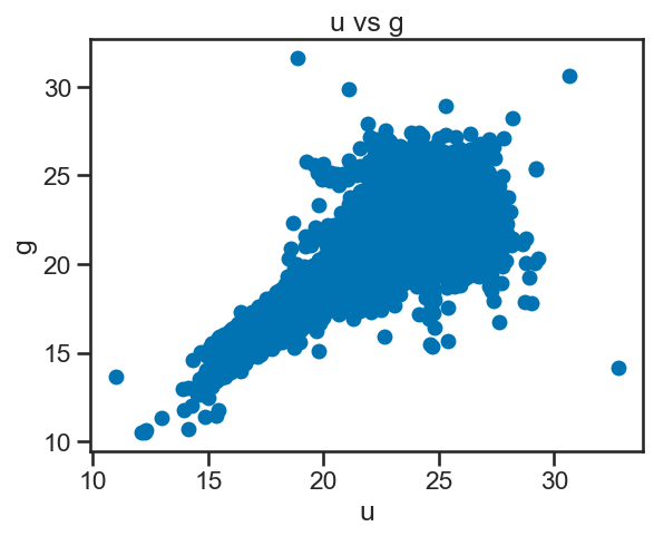
✅ Tasks:#
Create a scatter plot of
uvsgusingmatplotlib.Label the x and y axes and give the plot a title.
### your code here

# Create a figure and axes
fig, ax = plt.subplots()
# Plot data on the axes
ax.plot(df_stellar['u'], df_stellar['g'], 'o')
# Set the x and y axis labels
ax.set_xlabel('u')
ax.set_ylabel('g')
# Set the title of the plot
ax.set_title('u vs g')
# Show the plot
plt.show()
Now that you have the hang of it, let’s try a few more plots.
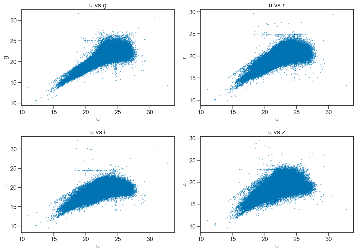
✅ Tasks:#
Create a series of scatter plots of
uvsg,uvsr,uvsi, anduvszin a single figure usingmatplotlib.
### your code here

# Create a 2x2 grid of scatter plots for u vs g, r, i, z
fig, axes = plt.subplots(2, 2, figsize=(14, 10))

# u vs g
axes[0, 0].scatter(df_stellar['u'], df_stellar['g'], s=2, alpha=0.5)
axes[0, 0].set_xlabel('u')
axes[0, 0].set_ylabel('g')
axes[0, 0].set_title('u vs g')

# u vs r
axes[0, 1].scatter(df_stellar['u'], df_stellar['r'], s=2, alpha=0.5)
axes[0, 1].set_xlabel('u')
axes[0, 1].set_ylabel('r')
axes[0, 1].set_title('u vs r')

# u vs i
axes[1, 0].scatter(df_stellar['u'], df_stellar['i'], s=2, alpha=0.5)
axes[1, 0].set_xlabel('u')
axes[1, 0].set_ylabel('i')
axes[1, 0].set_title('u vs i')

# u vs z
axes[1, 1].scatter(df_stellar['u'], df_stellar['z'], s=2, alpha=0.5)
axes[1, 1].set_xlabel('u')
axes[1, 1].set_ylabel('z')
axes[1, 1].set_title('u vs z')

plt.tight_layout()
plt.show()
Ok, this is great, but we should notice that there’s three classes of objects in the data: galaxy, star, and quasar. We can use this information to color the points in the scatter plot based on their class. You can do this by using the c parameter in the plot() function to specify the color of the points based on the class column.
For example, if you have a dataframe df with a column class, and variables x and y, you can create a scatter plot with points colored by class like this:
import matplotlib.pyplot as plt
# Create a figure and axes
fig, ax = plt.subplots()
# Plot data on the axes, coloring by class
ax.scatter(df['x'], df['y'], c=df['class'].astype('category').cat.codes, cmap='viridis')
# Set the x and y axis labels
ax.set_xlabel('x')
ax.set_ylabel('y')
# Set the title of the plot
ax.set_title('x vs y colored by class')
# Show the plot
plt.show()
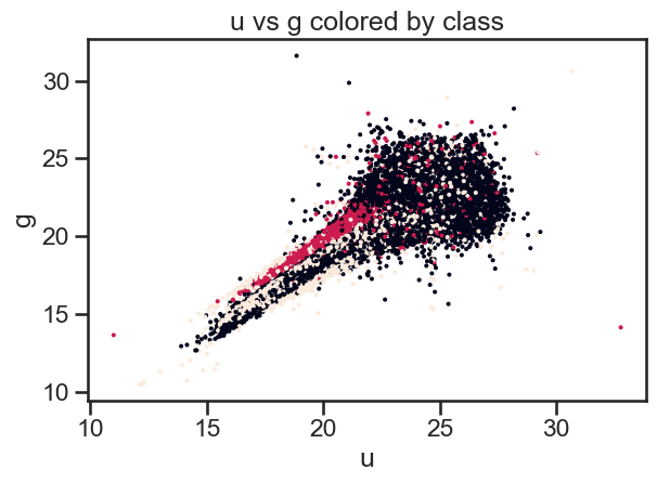
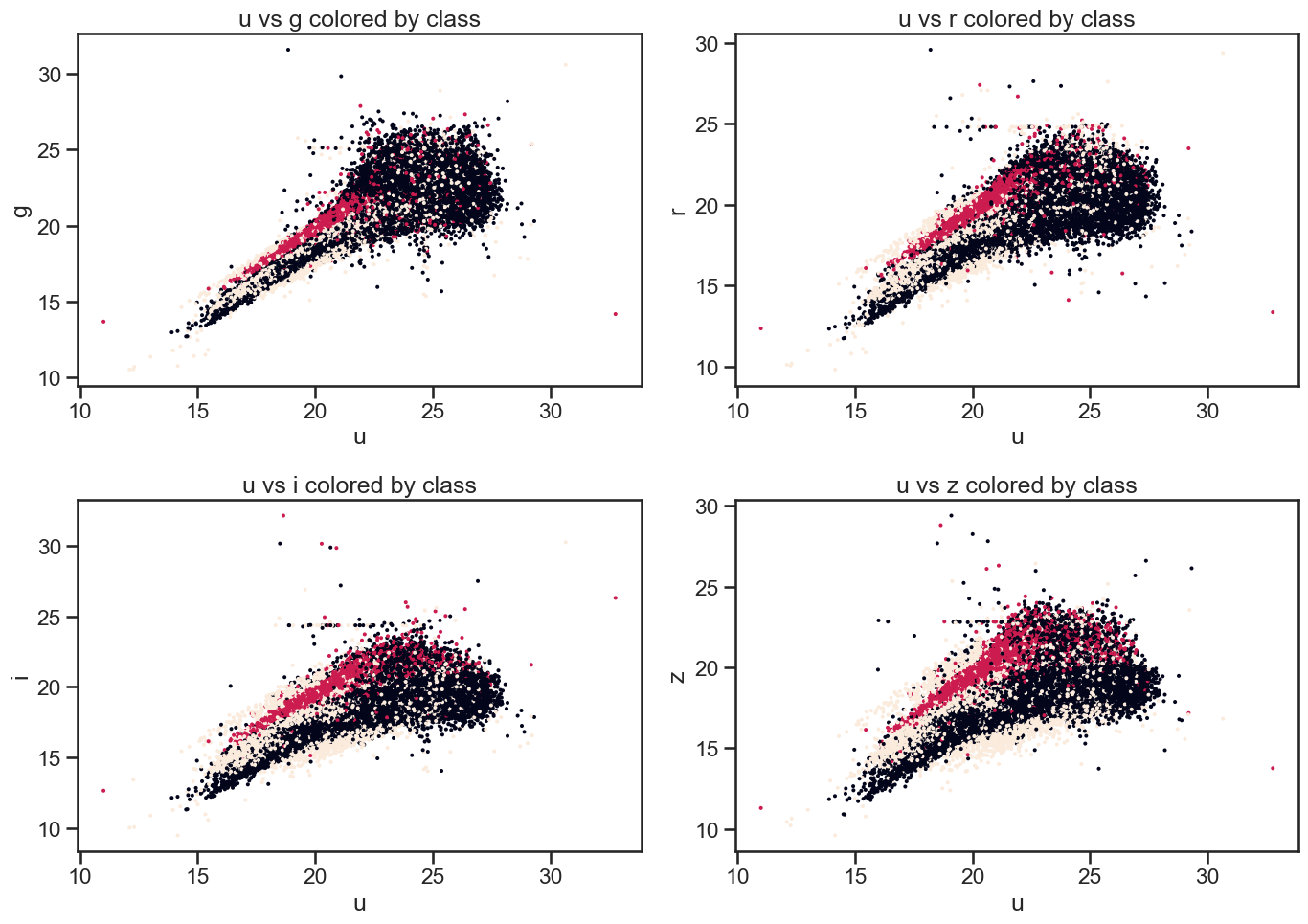
✅ Tasks:#
Create a scatter plot of
uvsgcolored by class usingmatplotlib.Create a series of scatter plots of
uvsg,uvsr,uvsi, anduvszin a single figure usingmatplotlib, colored by class.
### your code here

# Plot u vs g colored by class of object using matplotlib
fig, ax = plt.subplots()

ax.scatter(df_stellar['u'], df_stellar['g'], c=df_stellar['class'].astype('category').cat.codes, s=2)

ax.set_xlabel('u')
ax.set_ylabel('g')
ax.set_title('u vs g colored by class')
plt.tight_layout()
plt.show()

# Plot u vs all other bands colored by class of object using matplotlib
fig, axes = plt.subplots(2, 2, figsize=(14, 10))

# u vs g
axes[0, 0].scatter(df_stellar['u'], df_stellar['g'], c=df_stellar['class'].astype('category').cat.codes, s=2)
axes[0, 0].set_xlabel('u')
axes[0, 0].set_ylabel('g')
axes[0, 0].set_title('u vs g colored by class')

# u vs r
axes[0, 1].scatter(df_stellar['u'], df_stellar['r'], c=df_stellar['class'].astype('category').cat.codes, s=2)
axes[0, 1].set_xlabel('u')
axes[0, 1].set_ylabel('r')
axes[0, 1].set_title('u vs r colored by class')

# u vs i
axes[1, 0].scatter(df_stellar['u'], df_stellar['i'], c=df_stellar['class'].astype('category').cat.codes, s=2)
axes[1, 0].set_xlabel('u')
axes[1, 0].set_ylabel('i')
axes[1, 0].set_title('u vs i colored by class')

# u vs z
axes[1, 1].scatter(df_stellar['u'], df_stellar['z'], c=df_stellar['class'].astype('category').cat.codes, s=2)
axes[1, 1].set_xlabel('u')
axes[1, 1].set_ylabel('z')
axes[1, 1].set_title('u vs z colored by class')

plt.tight_layout()
plt.show()
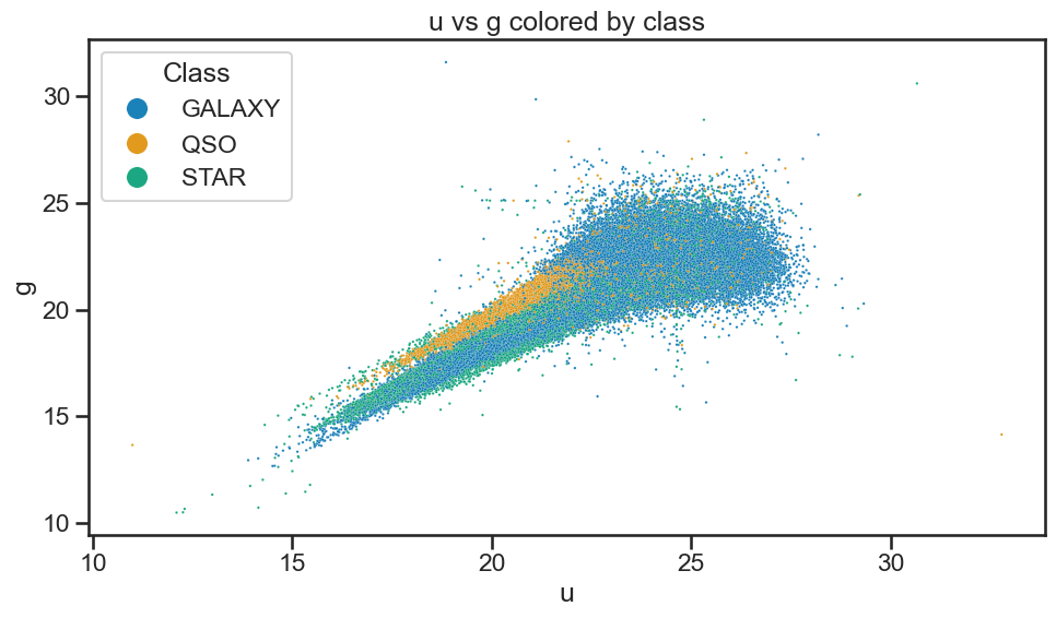
3.2 Using seaborn#
These plots are great, but they are not as visually appealing as we would like. Also, we would additional information about the plots to make them more informative. This is where seaborn comes in. seaborn is built on top of matplotlib and provides a high-level interface for drawing attractive and informative statistical graphics. It simplifies the process of creating complex visualizations.
For example, let’s create a scatter plot of u vs g using seaborn and color the points by class. For a data frame df with columns x, y, and class, you can create a scatter plot like this:
import seaborn as sns
# Create a scatter plot of x vs y colored by class
sns.scatterplot(data=df, x='x', y='y', hue='class')
# Set the title of the plot
plt.title('x vs y colored by class')
# Show the plot
plt.show()
See how easy that was? seaborn takes care of the details for us, such as adding a legend and setting the colors based on the class column.
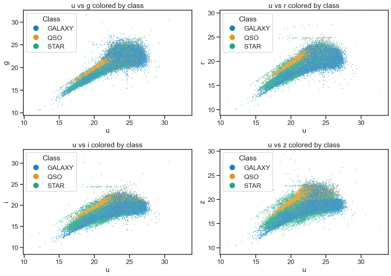
✅ Tasks:#
Create a scatter plot of
uvsgcolored by class usingseaborn.Create a series of scatter plots of
uvsg,uvsr,uvsi, anduvszin a single figure usingseaborn, colored by class.
### your code here

# Plot u vs g colored by class of object using seaborn
plt.figure(figsize=(10, 6))

sns.scatterplot(x='u', y='g', hue='class', data=df_stellar, alpha=0.9, s=3)

plt.xlabel('u')
plt.ylabel('g')

plt.title('u vs g colored by class')

plt.legend(title='Class', loc='upper left', markerscale=8)

plt.tight_layout()
plt.show()

# Plot u vs all other bands colored by class of object using seaborn built-in function

fig, axes = plt.subplots(2, 2, figsize=(14, 10))

# u vs g
sns.scatterplot(x='u', y='g', hue='class', data=df_stellar, ax=axes[0, 0], alpha=0.9, s=3)
axes[0, 0].set_xlabel('u')
axes[0, 0].set_ylabel('g')
axes[0, 0].set_title('u vs g colored by class')
axes[0, 0].legend(title='Class', loc='upper left', markerscale=8)

# u vs r
sns.scatterplot(x='u', y='r', hue='class', data=df_stellar, ax=axes[0, 1], alpha=0.9, s=3)
axes[0, 1].set_xlabel('u')
axes[0, 1].set_ylabel('r')
axes[0, 1].set_title('u vs r colored by class')
axes[0, 1].legend(title='Class', loc='upper left', markerscale=8)

# u vs i
sns.scatterplot(x='u', y='i', hue='class', data=df_stellar, ax=axes[1, 0], alpha=0.9, s=3)
axes[1, 0].set_xlabel('u')
axes[1, 0].set_ylabel('i')
axes[1, 0].set_title('u vs i colored by class')
axes[1, 0].legend(title='Class', loc='upper left', markerscale=8)

# u vs z
sns.scatterplot(x='u', y='z', hue='class', data=df_stellar, ax=axes[1, 1], alpha=0.9, s=3)
axes[1, 1].set_xlabel('u')
axes[1, 1].set_ylabel('z')
axes[1, 1].set_title('u vs z colored by class')
axes[1, 1].legend(title='Class', loc='upper left', markerscale=8)


plt.tight_layout()
plt.show()
4. Data analysis#
Great! Now that we’ve learned to import data, to review it for issues, and to visualize it, we can start to do some data analysis. For these tasks, you will need to investigate how to perform the analysis and present the results. You can use the documentation for pandas, matplotlib, and seaborn to help you with this.
You are welcome to use any additional libraries that you like.
Research questions#
What is the distribution of the photometric values (
u,g,r,i,z) for each class? That is, how do the photometric values vary for each class of object? Think histograms, box plots, or violin plots.How do the photometric values (
u,g,r,i,z) linearly correlate with each other for each class? Think scatter plots; correlation matrices; and lines of best fit.What is the distribution of redshift values for each class? Think histograms or box plots.
How do photometric values (
u,g,r,i,z) vary with redshift for each class? Think scatter plots with lines of best fit.
✅ Tasks:#
Work in groups to answer the research questions.
Use the documentation for
pandas,matplotlib, andseabornto help you with the analysis.Document your analysis in the notebook, including any code you used and the results of your analysis.
Take your time, there’s no rush to complete all the tasks. The goal is to learn how to use the tools and to practice data analysis.
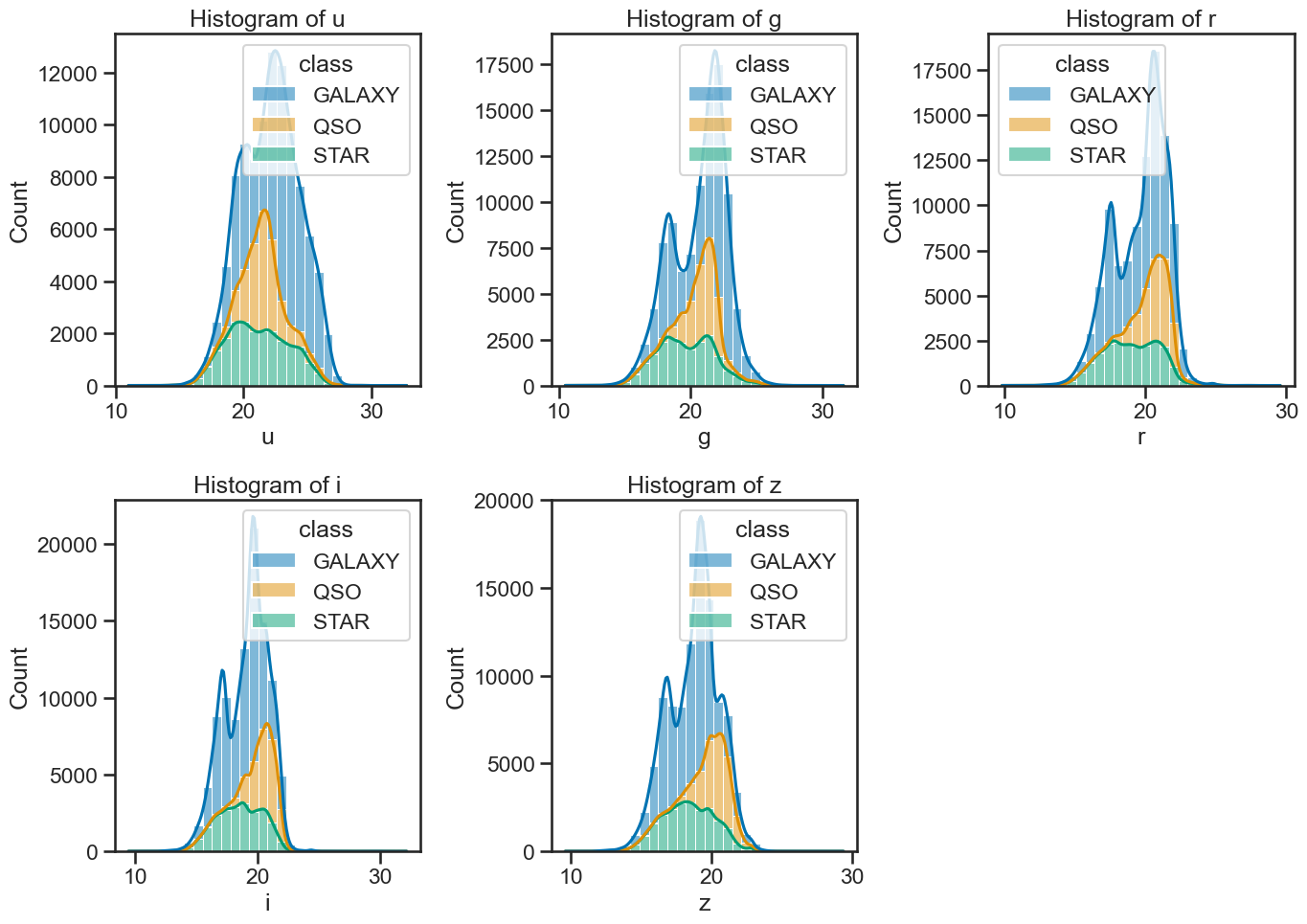
### your code here

# create subplots
fig, axes = plt.subplots(2, 3, figsize=(14, 10))

# use seaborn to plot histograms of u, g, r, i, z
# include the class as hue
# and use kde for density estimation
sns.histplot(data=df_stellar, x='u', hue='class', multiple='stack', ax=axes[0, 0], bins=30, kde=True)
sns.histplot(data=df_stellar, x='g', hue='class', multiple='stack', ax=axes[0, 1], bins=30, kde=True)
sns.histplot(data=df_stellar, x='r', hue='class', multiple='stack', ax=axes[0, 2], bins=30, kde=True)
sns.histplot(data=df_stellar, x='i', hue='class', multiple='stack', ax=axes[1, 0], bins=30, kde=True)
sns.histplot(data=df_stellar, x='z', hue='class', multiple='stack', ax=axes[1, 1], bins=30, kde=True)

axes[1, 2].axis('off')  # Hide the empty subplot

# set titles for each subplot
axes[0, 0].set_title('Histogram of u')
axes[0, 1].set_title('Histogram of g')
axes[0, 2].set_title('Histogram of r')
axes[1, 0].set_title('Histogram of i')
axes[1, 1].set_title('Histogram of z')

plt.tight_layout()
plt.show()
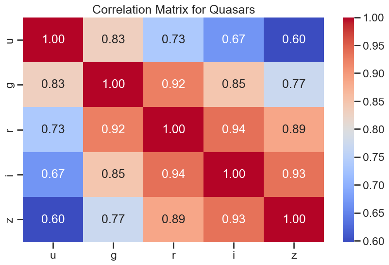
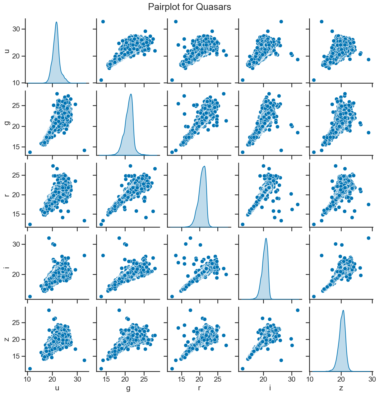
### your code here

### Create separate DataFrames for each class
df_quasar = df_stellar[df_stellar['class'] == 'QSO']
df_galaxy = df_stellar[df_stellar['class'] == 'GALAXY']
df_star = df_stellar[df_stellar['class'] == 'STAR']

# correlation plots for quasars
plt.figure(figsize=(10, 6))
sns.heatmap(df_quasar[['u', 'g', 'r', 'i', 'z']].corr(), annot=True, cmap='coolwarm', fmt='.2f')
plt.title('Correlation Matrix for Quasars')
plt.show()

# matrix of scatter plots for quasars
sns.pairplot(df_quasar[['u', 'g', 'r', 'i', 'z']], diag_kind='kde')
plt.suptitle('Pairplot for Quasars', y=1.02)
plt.show()
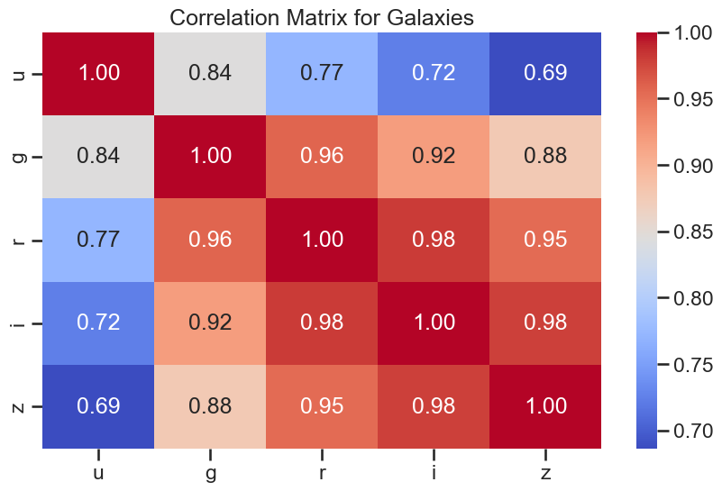
### your code here
# correlation plots for galaxies
plt.figure(figsize=(10, 6))
sns.heatmap(df_galaxy[['u', 'g', 'r', 'i', 'z']].corr(), annot=True, cmap='coolwarm', fmt='.2f')
plt.title('Correlation Matrix for Galaxies')
plt.show()
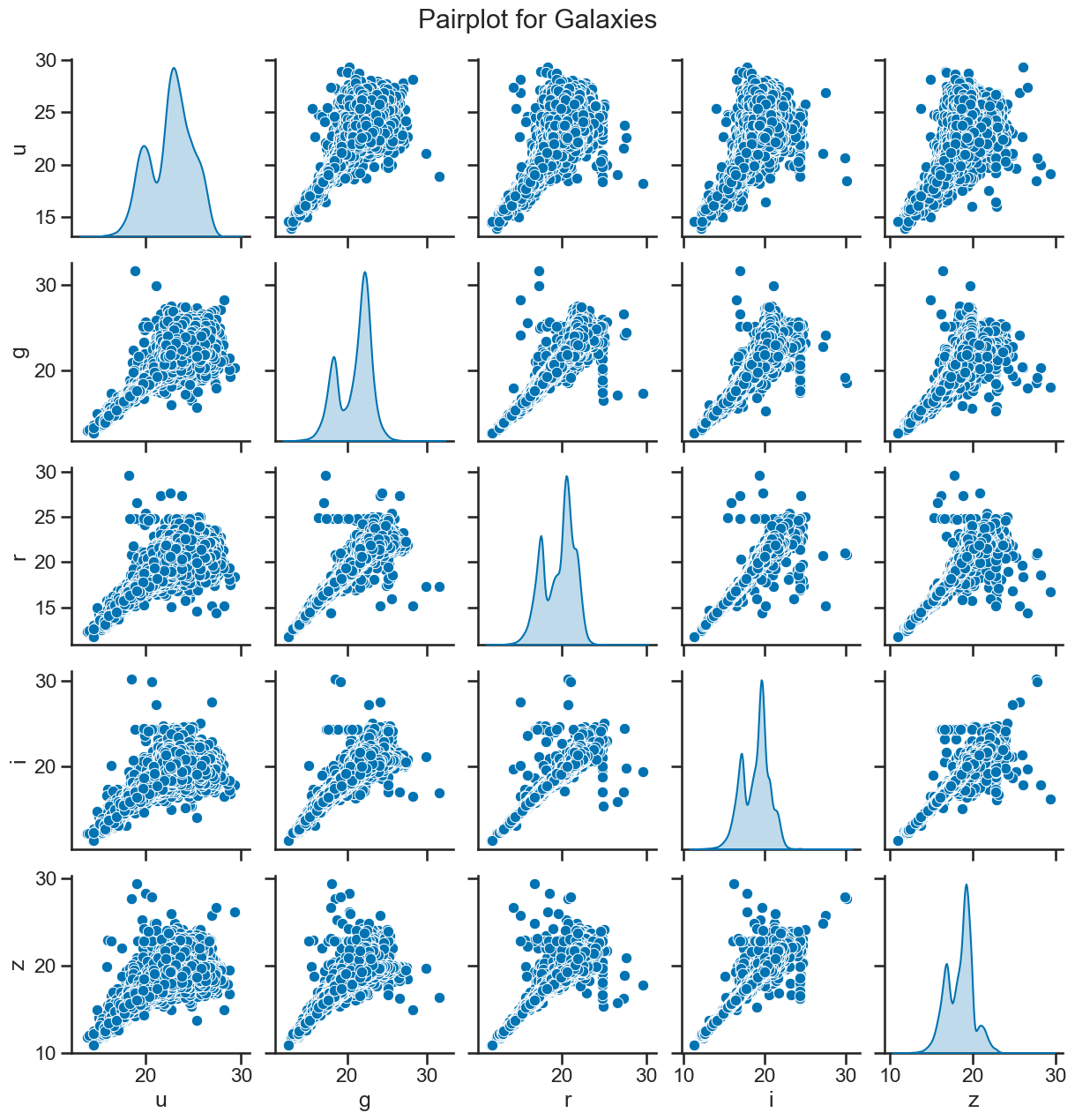
# matrix of scatter plots for galaxies
sns.pairplot(df_galaxy[['u', 'g', 'r', 'i', 'z']], diag_kind='kde')
plt.suptitle('Pairplot for Galaxies', y=1.02)
plt.show()
### your code here
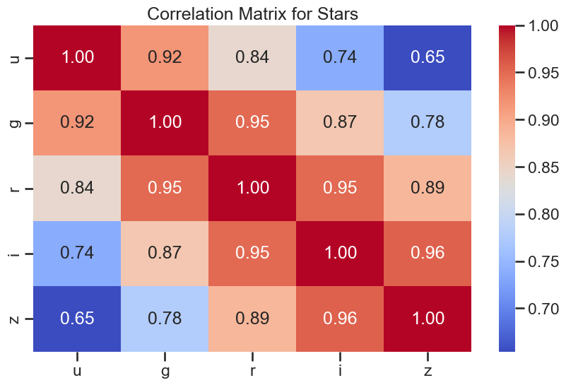
# correlation plots for stars
plt.figure(figsize=(10, 6))
sns.heatmap(df_star[['u', 'g', 'r', 'i', 'z']].corr(), annot=True, cmap='coolwarm', fmt='.2f')
plt.title('Correlation Matrix for Stars')
plt.show()
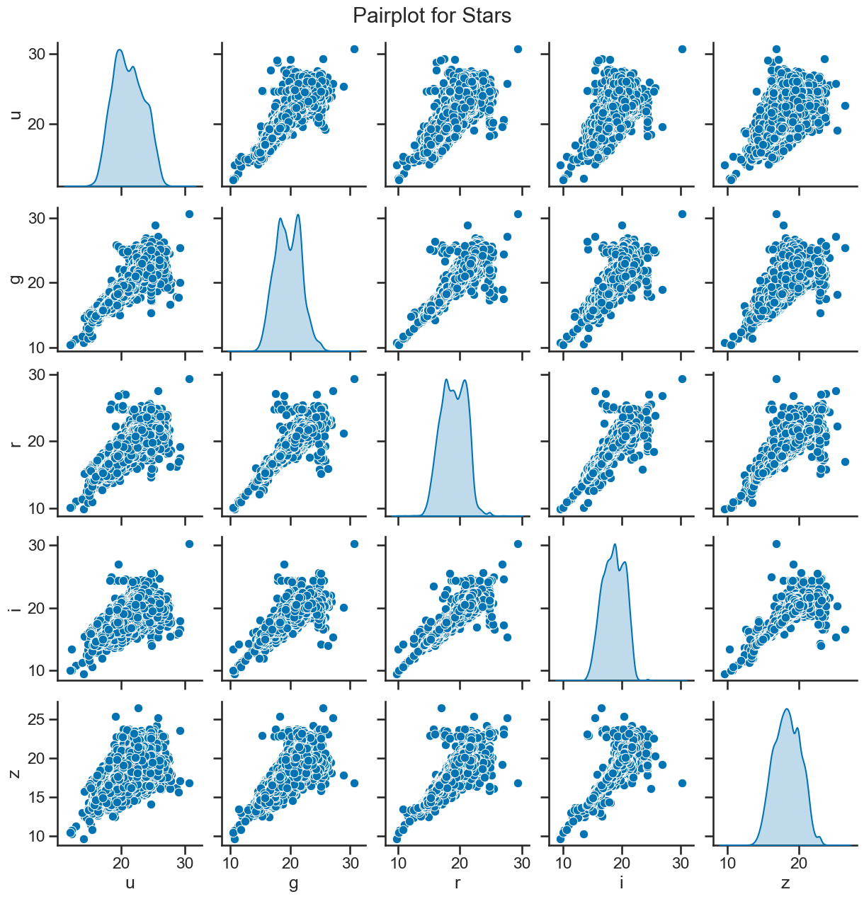
# matrix of scatter plots for stars
sns.pairplot(df_star[['u', 'g', 'r', 'i', 'z']], diag_kind='kde')
plt.suptitle('Pairplot for Stars', y=1.02)
plt.show()
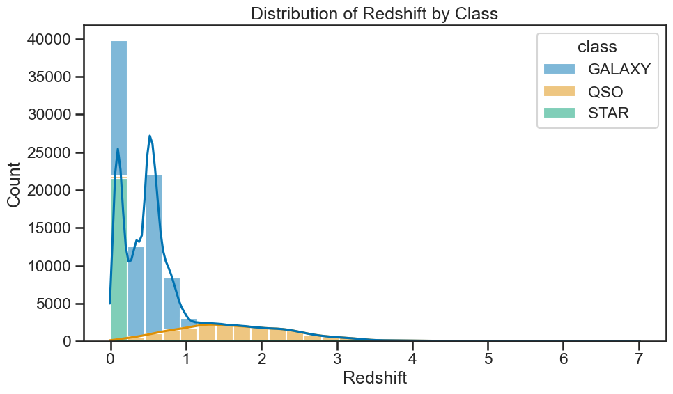
### your code here

# for each class, plot the distribution of redshift
plt.figure(figsize=(10, 6))
sns.histplot(data=df_stellar, x='redshift', hue='class', multiple='stack', bins=30, kde=True)
plt.title('Distribution of Redshift by Class')
plt.xlabel('Redshift')
plt.ylabel('Count')
plt.tight_layout()
plt.show()
### your code here
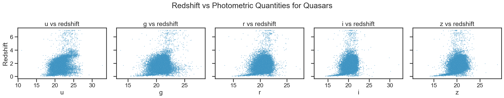
# Plotting redshift against photometric quantities for quasars
fig, axes = plt.subplots(1, 5, figsize=(20, 4), sharey=True)
sns.scatterplot(x='u', y='redshift', data=df_quasar, ax=axes[0], alpha=0.5, s=3)
axes[0].set_xlabel('u')
axes[0].set_title('u vs redshift')
sns.scatterplot(x='g', y='redshift', data=df_quasar, ax=axes[1], alpha=0.5, s=3)
axes[1].set_xlabel('g')
axes[1].set_title('g vs redshift')
sns.scatterplot(x='r', y='redshift', data=df_quasar, ax=axes[2], alpha=0.5, s=3)
axes[2].set_xlabel('r')
axes[2].set_title('r vs redshift')
sns.scatterplot(x='i', y='redshift', data=df_quasar, ax=axes[3], alpha=0.5, s=3)
axes[3].set_xlabel('i')
axes[3].set_title('i vs redshift')
sns.scatterplot(x='z', y='redshift', data=df_quasar, ax=axes[4], alpha=0.5, s=3)
axes[4].set_xlabel('z')
axes[4].set_title('z vs redshift')
axes[0].set_ylabel('Redshift')
for ax in axes[1:]:
ax.set_ylabel('')
plt.suptitle('Redshift vs Photometric Quantities for Quasars')
plt.tight_layout()
plt.show()
### your code here
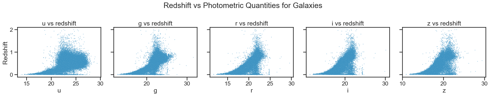
# Plotting redshift against photometric quantities for galaxies
fig, axes = plt.subplots(1, 5, figsize=(20, 4), sharey=True)
sns.scatterplot(x='u', y='redshift', data=df_galaxy, ax=axes[0], alpha=0.5, s=3)
axes[0].set_xlabel('u')
axes[0].set_title('u vs redshift')
sns.scatterplot(x='g', y='redshift', data=df_galaxy, ax=axes[1], alpha=0.5, s=3)
axes[1].set_xlabel('g')
axes[1].set_title('g vs redshift')
sns.scatterplot(x='r', y='redshift', data=df_galaxy, ax=axes[2], alpha=0.5, s=3)
axes[2].set_xlabel('r')
axes[2].set_title('r vs redshift')
sns.scatterplot(x='i', y='redshift', data=df_galaxy, ax=axes[3], alpha=0.5, s=3)
axes[3].set_xlabel('i')
axes[3].set_title('i vs redshift')
sns.scatterplot(x='z', y='redshift', data=df_galaxy, ax=axes[4], alpha=0.5, s=3)
axes[4].set_xlabel('z')
axes[4].set_title('z vs redshift')
axes[0].set_ylabel('Redshift')
for ax in axes[1:]:
ax.set_ylabel('')
plt.suptitle('Redshift vs Photometric Quantities for Galaxies')
plt.tight_layout()
plt.show()
### your code here
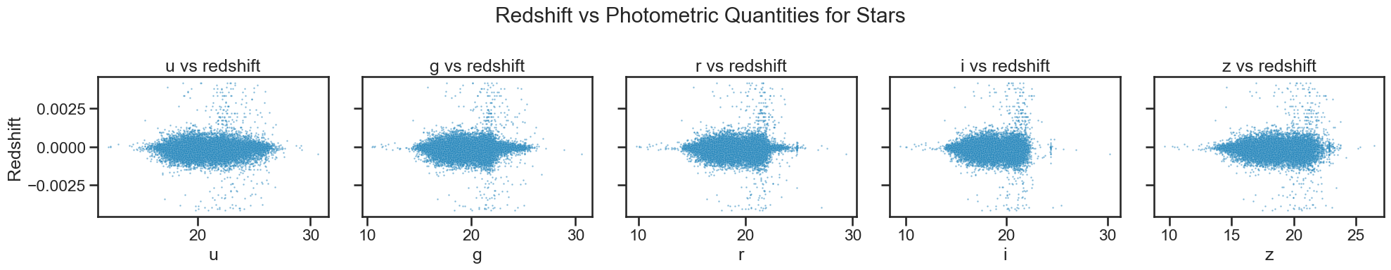
# Plotting redshift against photometric quantities for stars
fig, axes = plt.subplots(1, 5, figsize=(20, 4), sharey=True)
sns.scatterplot(x='u', y='redshift', data=df_star, ax=axes[0], alpha=0.5, s=3)
axes[0].set_xlabel('u')
axes[0].set_title('u vs redshift')
sns.scatterplot(x='g', y='redshift', data=df_star, ax=axes[1], alpha=0.5, s=3)
axes[1].set_xlabel('g')
axes[1].set_title('g vs redshift')
sns.scatterplot(x='r', y='redshift', data=df_star, ax=axes[2], alpha=0.5, s=3)
axes[2].set_xlabel('r')
axes[2].set_title('r vs redshift')
sns.scatterplot(x='i', y='redshift', data=df_star, ax=axes[3], alpha=0.5, s=3)
axes[3].set_xlabel('i')
axes[3].set_title('i vs redshift')
sns.scatterplot(x='z', y='redshift', data=df_star, ax=axes[4], alpha=0.5, s=3)
axes[4].set_xlabel('z')
axes[4].set_title('z vs redshift')
axes[0].set_ylabel('Redshift')
for ax in axes[1:]:
ax.set_ylabel('')
plt.suptitle('Redshift vs Photometric Quantities for Stars')
plt.tight_layout()
plt.show()